-
Problem
Young professionals have a hard time finding easy ways to cook meals at home and developing their skills in the kitchen. As a result they waste food and money eating out.
-
Solution
Eat-In provides an easy way to lower food cost, minimize food waste, and find quick, simple meals to cook, leading to a healthier lifestyle while maintaining a budget due to the reduced amount of time eating out.
-
Impact
We added a progress calendar, and a favorite button to track the success of Eat-In. The progress calendar allows the user to visually see when they cooked using the app. The favorite button allows the user to begin collecting their favorite recipes, and see how popular a recipe is before they cook it.
-
Role
Research, Sketches, Wireframes, Prototype, Visual Design, Storyboard, User Testing
-
Team
Julian Garcia (myself), Erin Yurk, Janice Landree, Catherine Champion
-
Tools
Figma, Miro, Unsplash, Google Slides, Yum, Noom, Mealime, Menu Planner, Trello, Otter.ai
About
This mobile app case study was part of an intensive UX/UI bootcamp at the University of Texas at Austin. Our team was issued a design challenge to find a solution for an everyday problem. Boom! Eat-In was born a mobile app helping users solve the question, “what should I eat?'“
The Problem
Young professionals have a hard time finding easy ways to cook meals at home and developing their skills in the kitchen. As a result they waste food and money eating out.
The Solution
Step 1: User Research
Our team set out to discover how users currently go about meal prep, understand how meal planning could be made easier, and learn how users shopping habits relate to their cooking habits.
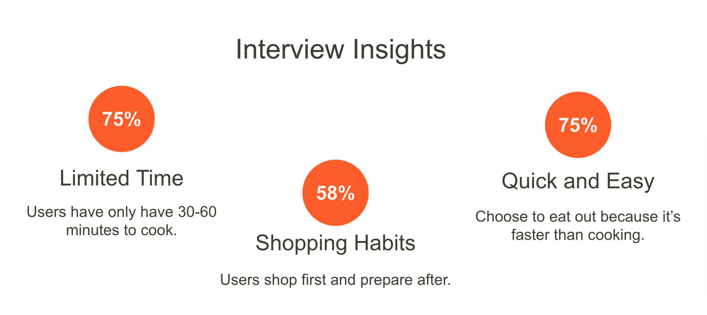
Our findings showed that the majority of users interviewed had limited time to cook a meal at home, and needed something that could be made quickly. While a little over half of users shopped for groceries first and planned what to eat after they had made their purchase.
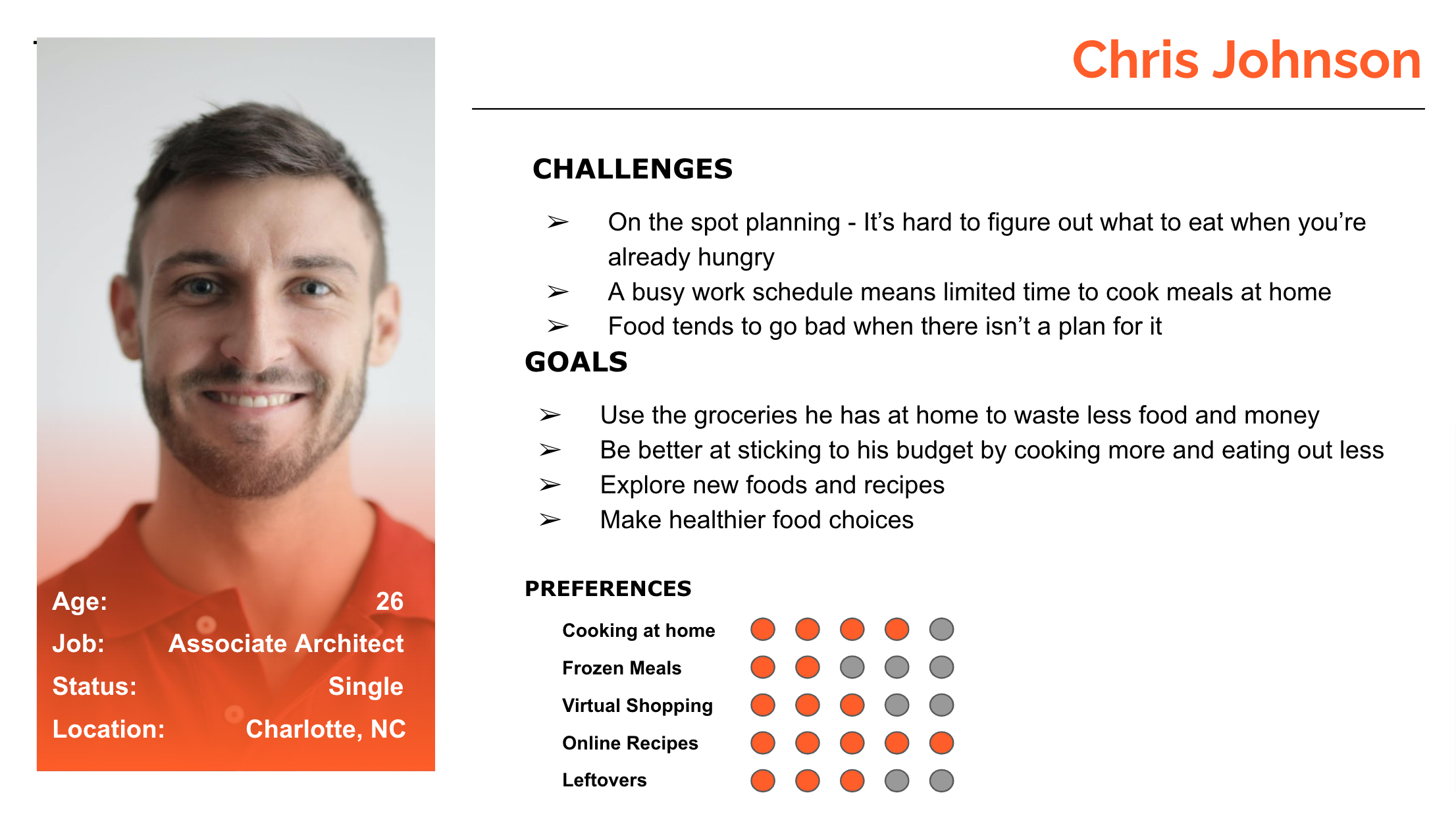
All the data we gathered helped developed our persona Chris Johnson. He’s a budget conscious individual who wants to lead a healthier lifestyle by eating at home. Unfortunately his job keeps him busy and he often has a difficult time deciding what to eat when he’s already hungry.
Step 2: Definition and Ideation
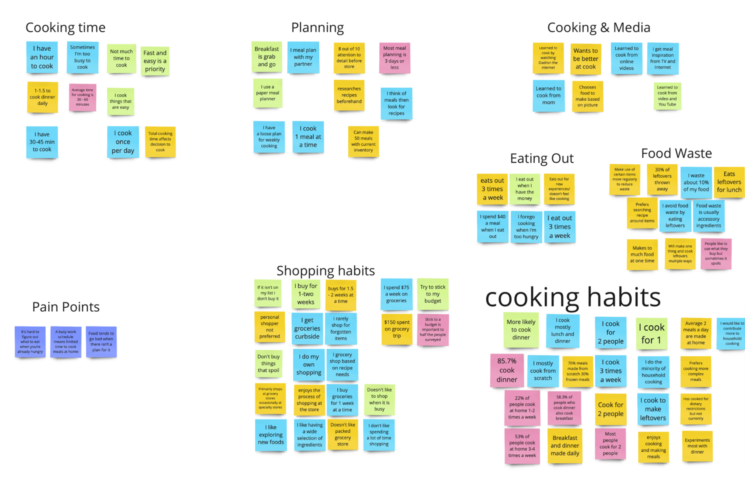
From our user research we synthesized our data and created an affinity diagram to find reoccurring themes across all of the users that were surveyed and interviewed.
Those responses were then separated using an“I like”, “I wish”, “What if” method to asses potential features. This in combination with a dot voting system created an environment free from bias and allowed us to focus on finding solutions for the users pain points.
With dot voting complete, we now had a visual representation of which features were going to allow our product to best meet the users goal. Our team took those results and began inputting them in to a prioritization matrix to understand which features would generate the most impact while maintaining technical plausibility.
This leads us to our story board which follows users like Chris, who are simply fed up with eating take out every day, until one day he learns about Eat-In and downloads it. Eat-In allows him to shop with a purpose, he knows exactly what meals he’s going to make for the week.
With our story board complete wee began working on a proposed user flow, that would serve as our guide map when moving towards the prototyping phase of our app. Our first iteration featured a rating system for cooked meals as well as a section for dietary restriction and food allergies. This purposed flow lacked a clear direct path for the user to navigate.
The second iteration of our user flow offered a more direct clear path allowing for things such as moving dietary restrictions and allergies under “account”, and swapping the initial rating feature to a favorites feature and giving users quick access to their favorite meals right from the home screen.
Step 3: Prototyping
Focused on offering young professionals such as Chris a quick and easy way to find recipes, and minimize food waste through planning and preparation we completed a competitor analysis. We found that there were numerous applications that allowed users to search for new recipes and filter certain types of foods based off of likes and dislikes. However, they failed to offer a way to search by ingredient. There were also many features or recipes that were locked, unless the user purchased either a monthly or yearly subscription.
Having gained an understanding that users had limited time when it came to cooking we began sketching wireframes.
From sketches we quickly got to work on our mid-fidelity prototype so we can begin our guerilla testing.
Step 4: Testing and Iteration
Our guerilla testing revealed that almost all of the users didn’t find our search function as intuitive as we intended. There was also a large amount of confusion surrounding our icon used to add ingredients to a list. Lastly marking a meal as cooked was another feature that was easily missed during our testing.
Step 5: Hi-Fidelity Prototyping
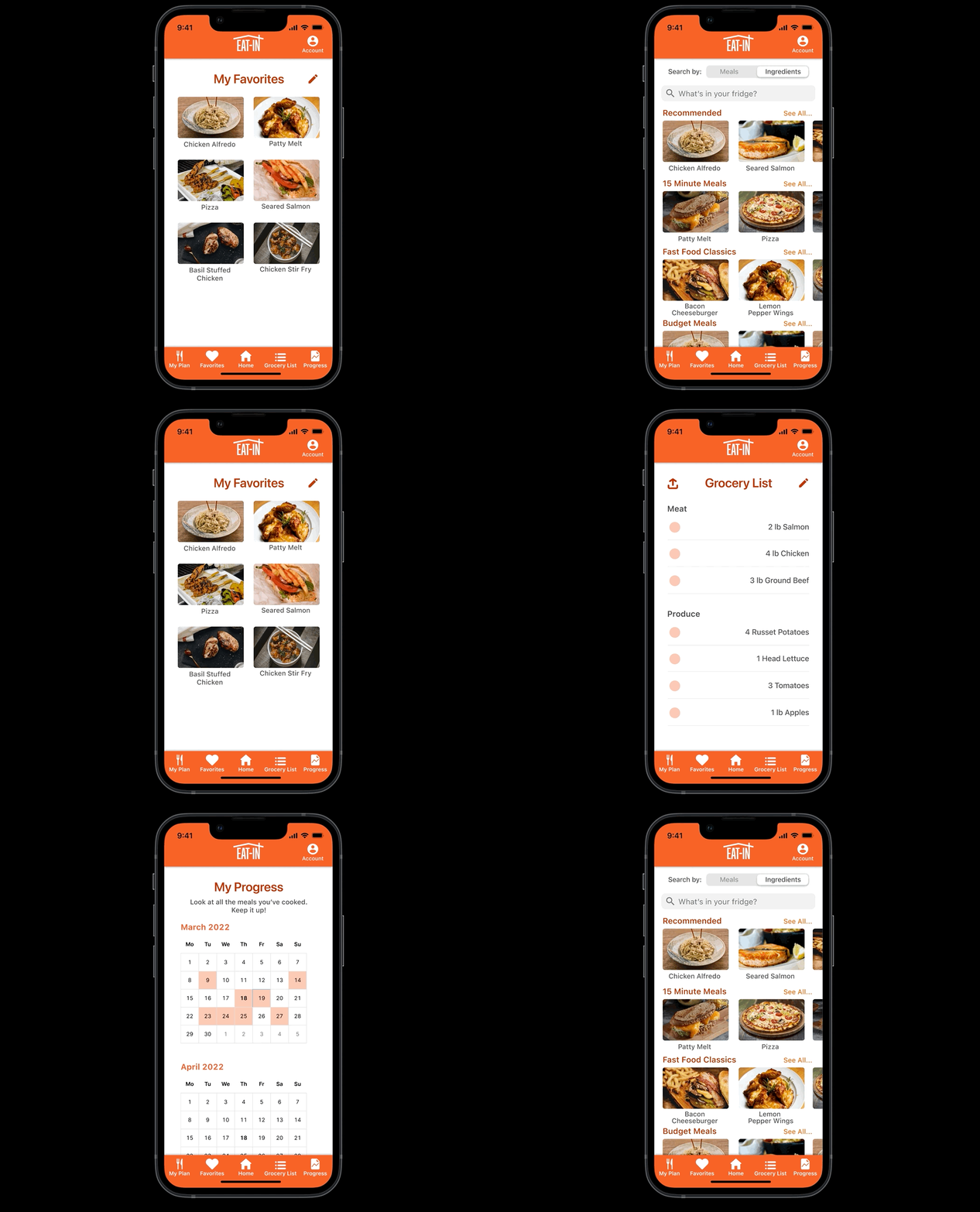
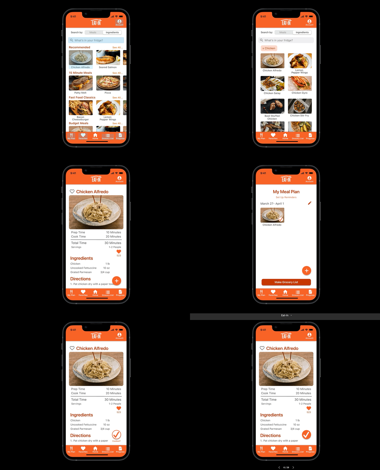
With the results of our testing in, it was clear we still had some work to do, so we started implementing those changes toward our high-fidelity prototype. Here is a quick walkthrough of the application.
on the home screen we changed the search function from a magnifying glass to a dedicated bar making it easier for the user to access and less confused.
The way a user would mark a meal as cooked to track their progress was also improved. Once the meal was added to the meal plan, the user would go back in to recipe when they’re cooking it and have the ability to check it off as cooked as well as being able to favorite it.
The other piece of feedback we received was about our add to grocery list button. Our solution was to add a button with text as a call to action rather than an icon that made things unclear and made the user feel weary of clicking it.
Results
Young professionals have a hard time finding easy ways to cook meals at home and developing their skills in the kitchen. As a result they waste food and money eating out. Eat-In provides an easy way to stop wasting money by minimize food waste, and find quick simple meals to cook, leading to a healthier lifestyle while maintaining a budget due to the reduced amount of time eating out.
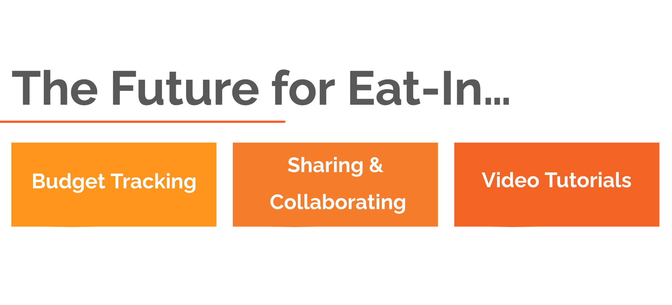
Our next steps and future plans for Eat-In include testing and iteration on the changes we made when creating our high-fidelity prototype and in the future implement other feature sets such as budget tracking, video tutorials, and a share and collaborate feature for users to plan their meals out together for events or family get togethers.

