Meals On Wheels Waco
A homepage redesign, generating an impact rate of 80% on new users.
Role
Research| Sketches| Wireframes | Prototype| Visual Design
Team
Me| Carmen Christopher | Casey Davis | Tiffany Repucci | Alex Mensz
Tools
Figma|Miro|Unsplash|Cook Unity|Hello Fresh|Chefs for Seniors|Slidesgo.com|Trello|Otter.ai
About
This UI case study was part of an intensive UX/UI bootcamp at the University of Texas at Austin. Our team was issued a design challenge focused on the non-profit space and find ways to better align their website with their current mission and goals. We believed we could make an impact on Meals on Wheels Waco’s current website. Meals on Wheels is an organization that promotes senior health by providing nutritious meals and facilitating social opportunities with an integrated volunteer and donor systems.
Problem
Meals on Wheels Waco currently has a waitlist. They cannot fulfill all client requests due to increased inquiries and rising food costs. As a result, they are suffering from an increase in demand for funding, resources, and volunteers.
Solution
We believe simplifying the volunteer sign up process and featuring client stories will evoke empathy in site users and recruit more volunteers to “wipe out the waitlist”
Impact
80% of users found the new volunteer sign up form more intuitive.
70% of users enjoyed reading the new client testimonials
80% of users liked the visualization of the steps for the volunteer sign up process.
The Solution
Step 1: User Research
The team set out to understand Meals on Wheels’ mission and strategies, learn about volunteer recruiting and retention rates, and analyze their current website heuristics and usability.
We did this by conducting a total of 12 remote user interviews, and conducting a usability test on their current website.
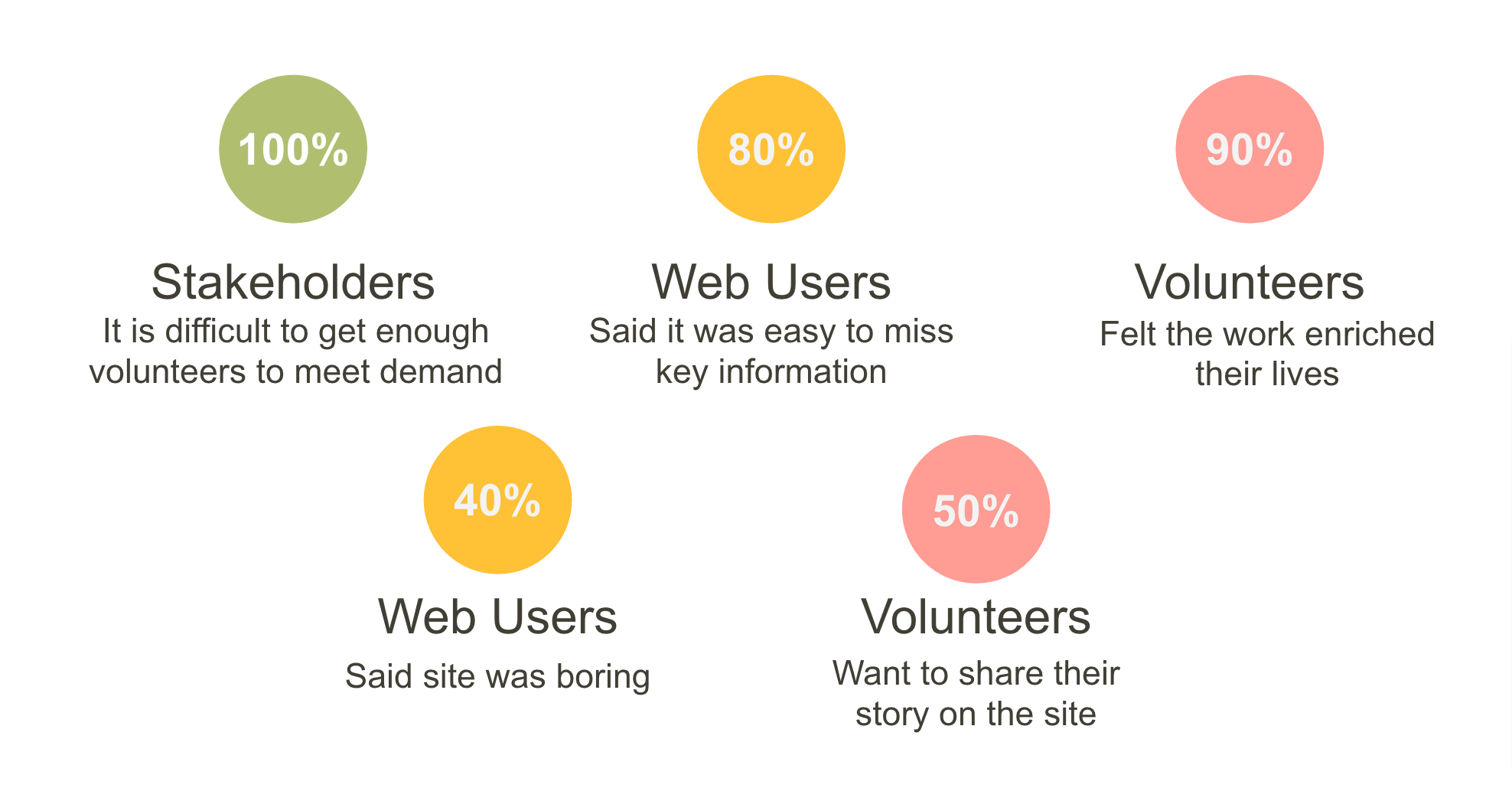
Our findings indicated Every stakeholder we interviewed agreed that it’s difficult to get volunteers. Most web users said it was easy to miss important information on the site and 40% felt the site was boring. Most volunteers felt like their work enriched their own lives, and half were interested in sharing their own stories on the website.
We started to hypothesize how we could help Meals on Wheels wipe out their waitlist, recruit more volunteers, and make the forms on their site easier for users.
Hypothesis:
We believe Meals on Wheels Waco could “wipe out their waitlist” and serve all interested clients by successfully meeting the current demands for more funding, resources, and volunteers.
From our hypothesis we formed a question.
“How might we” redesign the Meals on Wheels Waco volunteer form to be more intuitive and increase volunteer conversion rates?
We then developed an empathy map based on the data we acquired from our user interviews This person is someone who volunteers because of the compatibility with his job schedule, and enjoys the friendships that he makes on his delivery routes.
Empathy Map
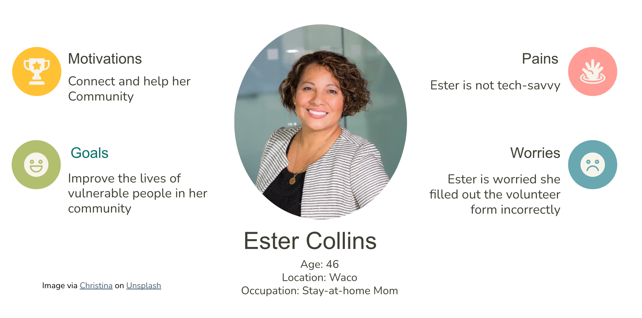
Based on our research, we decided to focus on our volunteer persona Ester Collins. Ester is an empty nester and wants to volunteer to be able to get out of her house and do something meaningful with her life now that her sons have gone to college.
Volunteer Persona
One of Ester’s main worries is that she did not fill out the volunteer form on the site correctly, since it contains many different entry fields on one page and does not prompt if the volunteer form was properly filled out and submitted.
Step 2: Definition and Ideation
We began this phase by looking at our user insights. We were told that the volunteer form was long, confusing, and required information users did not always have on hand. Users didn’t like the ambiguity of their status in the volunteer application process. This included the lack of a clear confirmation of a successful application.
We also found that volunteers wanted to share the importance of their work with others, and desired meaningful connections from their time with Meals on Wheels just as much as the clients they serve.
We utilized a feature prioritization matrix to identify what changes needed to be made and focused on the features that would resolve Ester’s pain points.
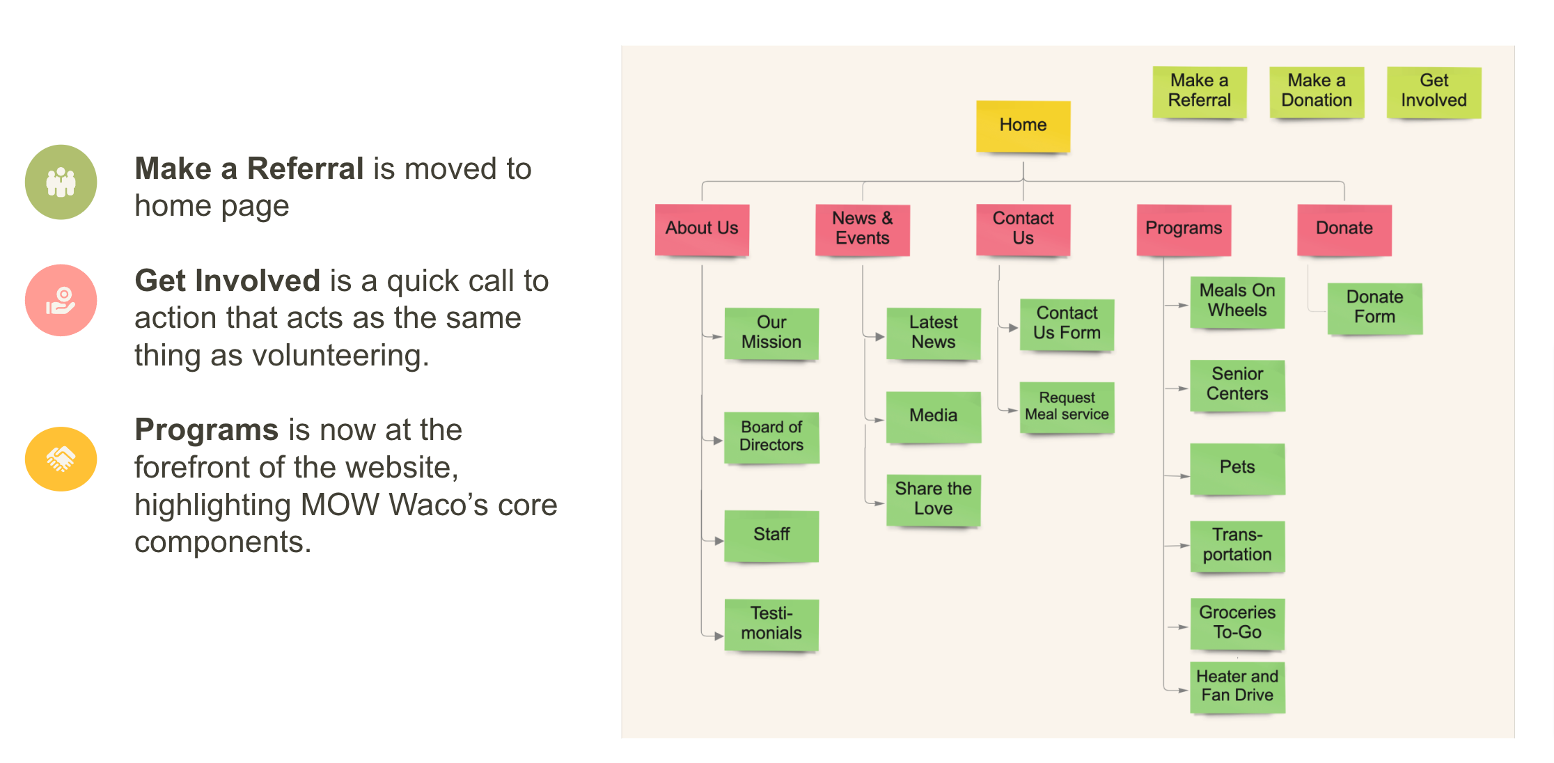
We completed a card sort of the current web site and constructed a new site map which eased the navigation.
Our storyboard follows the volunteer journey for people like Ester, from an initial desire to volunteer, through volunteer sign-up on the website, to eventual seasoned volunteer, visiting new friends on a weekly basis.
We also proposed a new volunteer flow keeping several opportunities while setting our sights on 2 heuristics:
Improving flow consistency and standards and the visibility of system status especially when submitting forms.
Step 3: Prototyping
With our focus on improving the volunteer sign up and generating more empathy throughout the sight, we began a competitor analysis and found that while many companies offer a variety of meal choices, their were numerous drawbacks including limited distribution areas, they were geared toward the technologically inclined, and are lacking the social element that Meals on Wheels meal delivery provides.
We began sketching our newly envisioned website for Meals on Wheels Waco keeping in mind to include a space for photos of real volunteers and the clients that they serve.
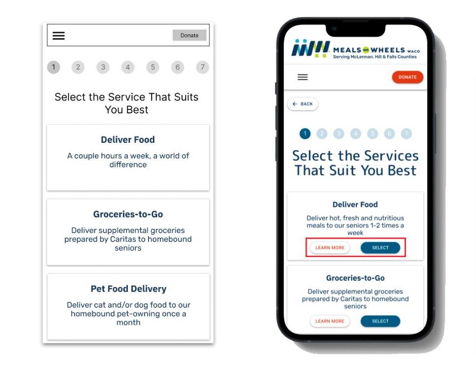
From sketches we created lo-fi mobile, tablet, and desktop prototypes prioritizing space for testimonials, we also included a status bar for the volunteer form process- to make applying simple and easy.
Lo-Fi Mobile prototype at a distance.
Lo-Fi tablet prototype at a distance.
Lo-Fi desktop prototype at a distance.
Step 4: Testing and Iteration
The completion of our lo-fi prototypes we began putting them through user testing and gained insight on how to improve the usability of our original design and implement those changes to our hi-fi prototypes.
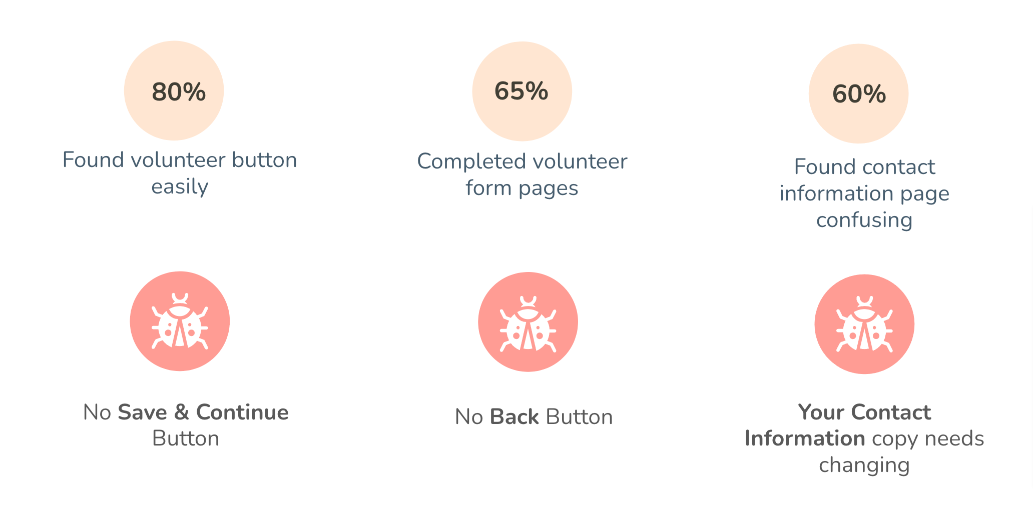
Our user tests showed that while we were seeing positive user feedback in the areas that we aimed to improve, we still had our work cut out for us.
There were some bugs such as missing buttons, which some users stated made them want to abandon the sign up process midway through, we also needed to edit the contact information copy for clarity.
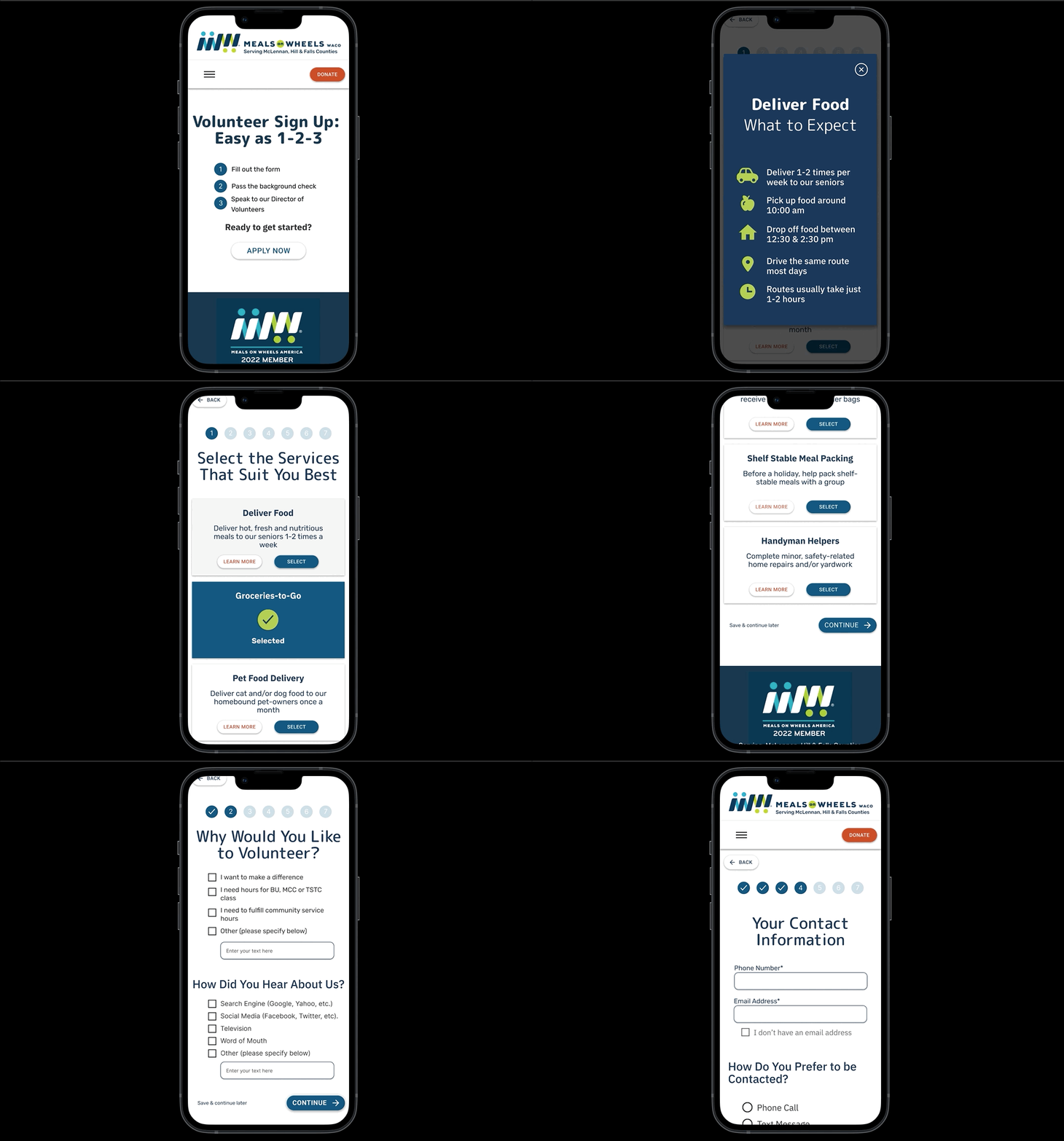
Here are the different ways people can volunteer with Meals on Wheels. We added a select button for each card so people could choose multiple ways in which they wanted to volunteer, as well as a learn more button so people could get more information about that particular volunteer task.
Changes made to the title now emphasize the newly simplified volunteer forms and reduced some copy. We also changed the button text from “sign up” to “apply now” since you have to be approved to volunteer.
Step 5: Hi-Fidelity Prototyping
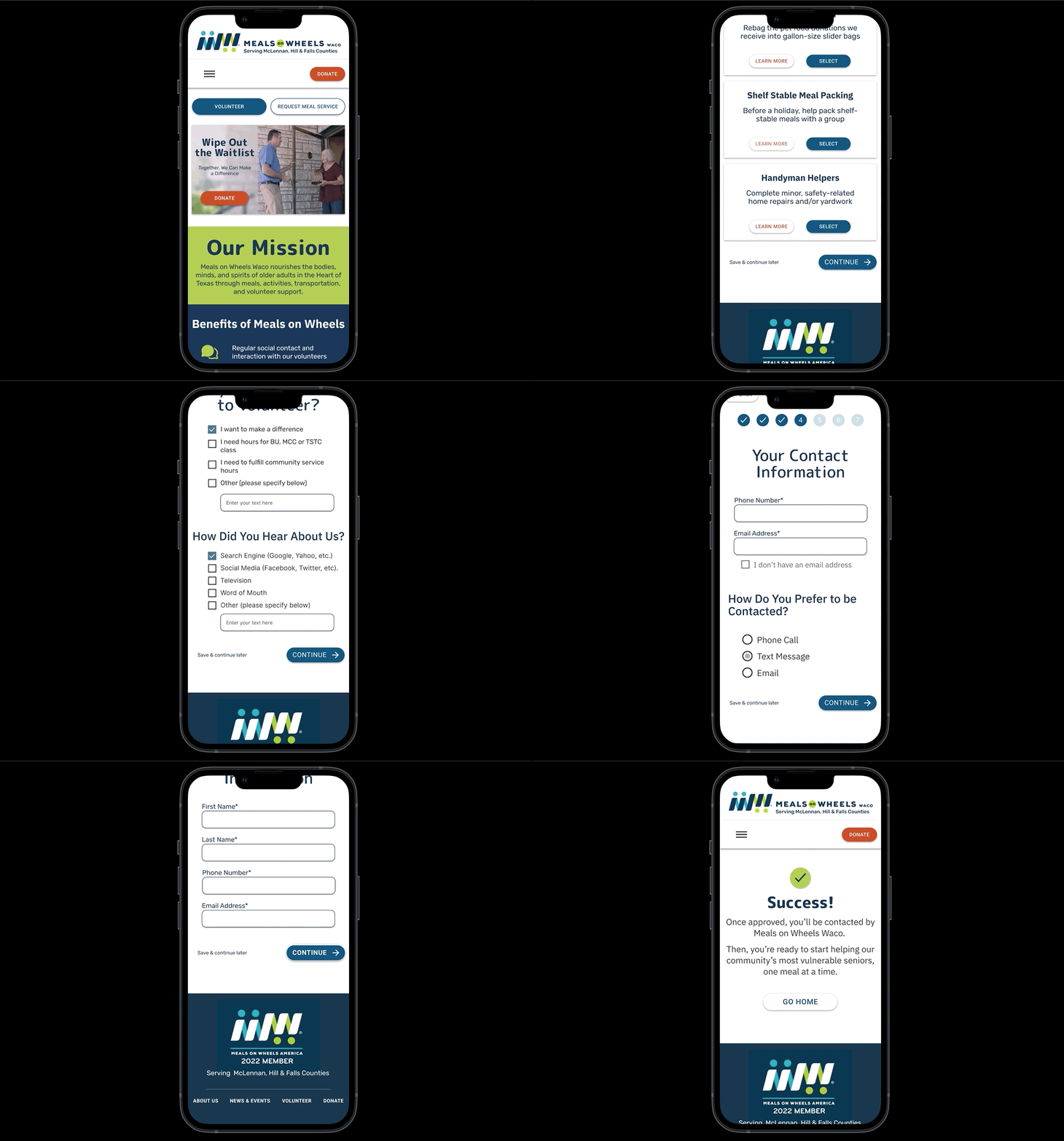
Our high-fidelity prototype, shows multiple calls to action with easy-to-spot volunteer and donate buttons.
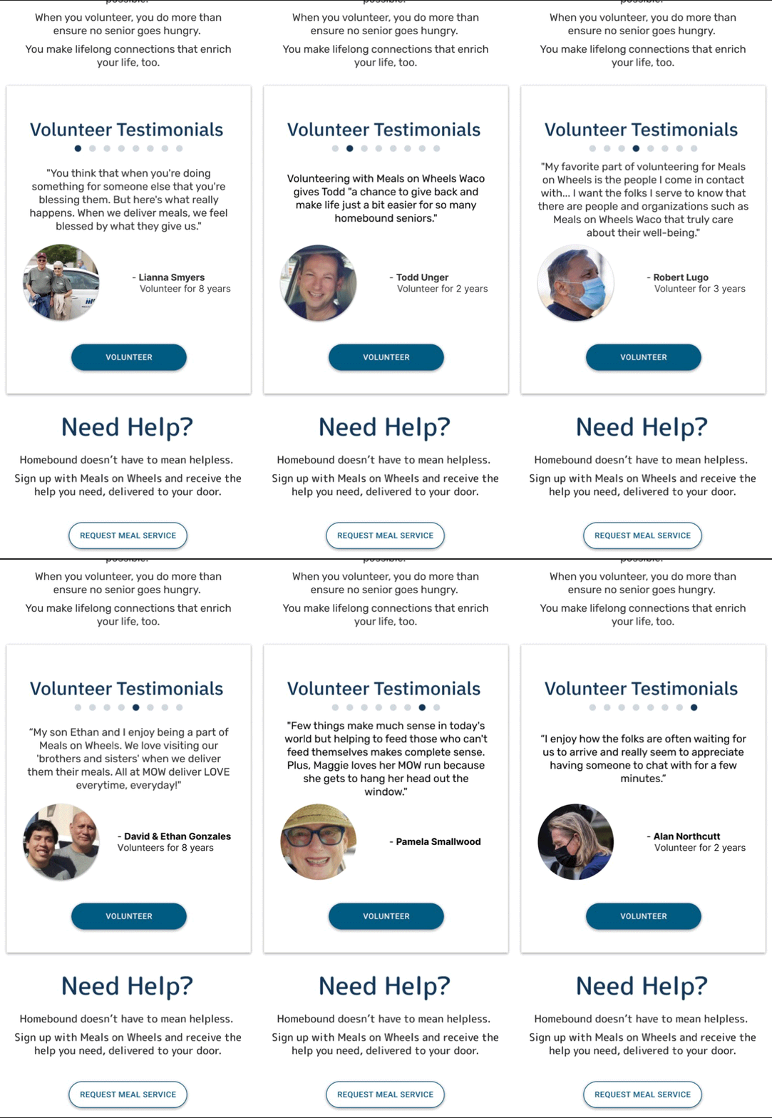
This is a close up of the carousel showcasing testimonials featuring quotes and pictures from actual Meals on Wheels Waco volunteers. Which is geared to tug at the heart strings of the user and encourage them to volunteer.
The updated and simplified volunteer task flow allows the user to choose which volunteer opportunities and learn more about what each program entails, all without kicking them out of the form.
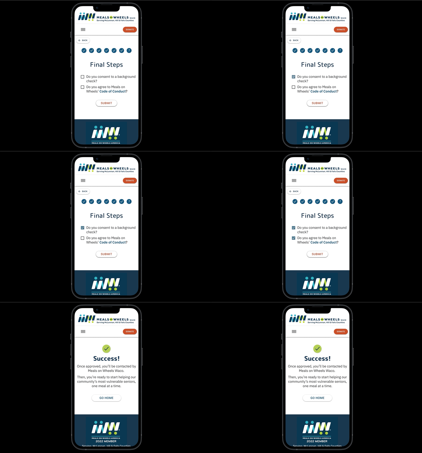
The progress bar can easily be seen at the top of the page. Making sure that everyone knows where they are in the application process. The original site had 1 long form that users found confusing based off our initial site test. We decided to break it up to increase ease of use, and ensure that the user feel confident that they weren’t missing any information.
The completion page, details what the user can expect once they inputs all the requested information. This screen also lets the user know their application was submitted successfully. This was a pain point for volunteers who never received a confirmation, or email about what to expect next.
Results
Meals on Wheels Waco has a waitlist resulting from an increase in demand, funding, and volunteers putting some of the most vulnerable people in the community at risk. Our redesign creates a more intuitive way for volunteers to sign up and reduce the waitlist by generating empathy in users by highlighting the stories of current volunteers and the impact that meals on wheels has on the community they serve.
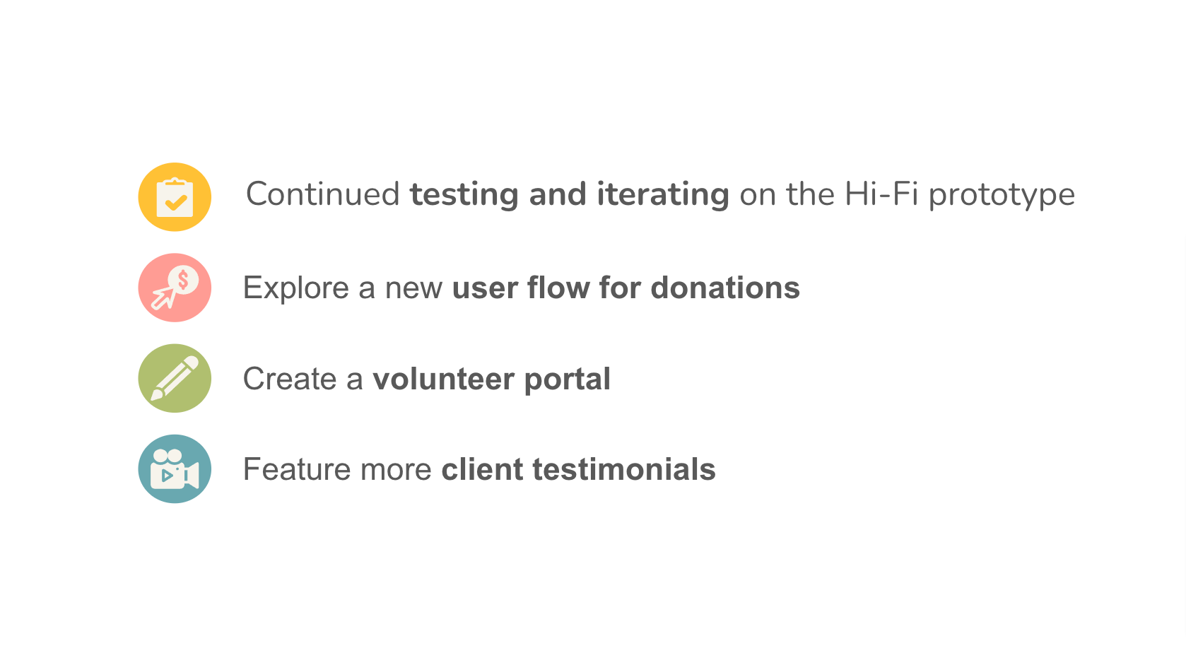
Our next steps include putting our hi fidelity prototype through user testing and iterate based off of user feedback. Explore and create a new user flow for donations, creating a portal for volunteers to have easy access to finding a substitute for their route, and featuring more client testimonials.
A few things I learned throughout the duration of this case study is that volunteering, not only enriches the lives of the clients but those who donate their time as well. I also gained an understanding of how effective communication and planning can greatly impact a teams success especially when working in a remote setting.


